 January 14, 2009 at 7:49 pm
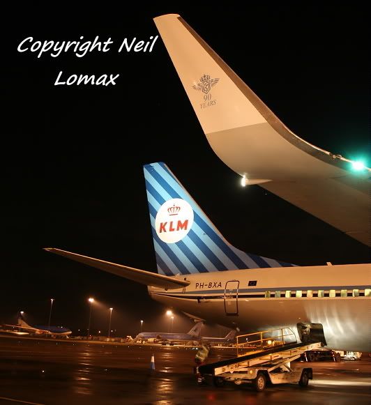
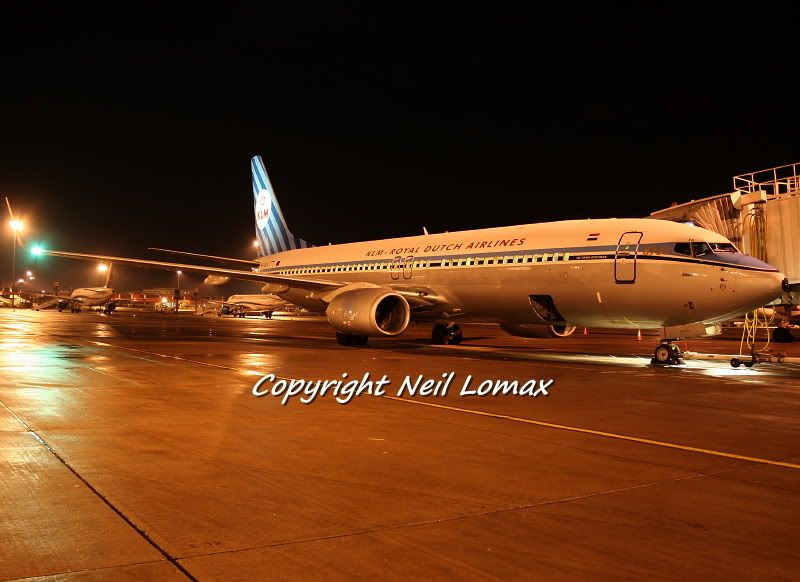
Caught on the ramp this mornin………….enjoy.:)


By: PMN - 16th January 2009 at 22:22
find it outstandingly more beautiful then the present livery. Even the typeface/font.
I have to agree. As much as I think KLM’s new scheme is one of the better in the European skies, I think the retrojet is gorgeous!
Nice work as always, Neil. Thanks for sharing!
Paul

By: LBARULES - 16th January 2009 at 21:42
I love the current KLM/KLC livery, and love that as well! Think it looks fantastic. 🙂

By: old shape - 16th January 2009 at 19:44
find it outstandingly more beautiful then the present livery. Even the typeface/font.
Have Martinair gone back to stripes too?

By: Ren Frew - 16th January 2009 at 19:33
A bit dull and lifeless compared to todays stand out livery!!!
I think the tail design is excellent and KLM should apply it to more jets in it’s anniversary year. I like it overall though, it’s quirky and seems to suit the 737. That said I’m also a fan of the contemporary KLM livery too.

By: Bristol_Rob - 16th January 2009 at 18:34
I agree Steve bloody horrible in my view 😀
Nice shots Neil
Rob
🙂

By: steve rowell - 16th January 2009 at 02:06
A bit dull and lifeless compared to todays stand out livery!!!