By: steve rowell - 8th October 2010 at 07:21
The livery would certainly stand out on any Airport ramp..nice shots once again Keith
By: wesleyscott - 6th October 2010 at 13:15
great livery!
By: cloud_9 - 5th October 2010 at 21:29
I think it looks fintastic! (Just thought I would get in on the act there!:D)
As for the yellow spot, I don’t see a problem with it, in fact I think its what makes it a bit more quirky and its quite a nice thing, otherwise it would simply be another dull blue&white livery, but still an improvement on the previous one for sure!
By: Arabella-Cox - 5th October 2010 at 17:01
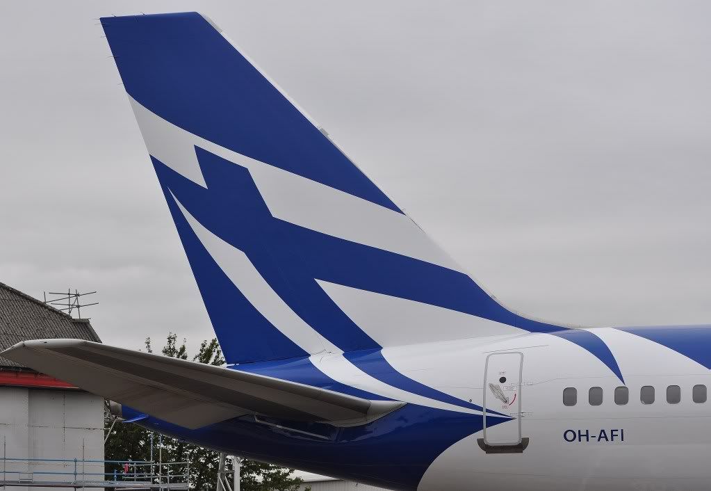
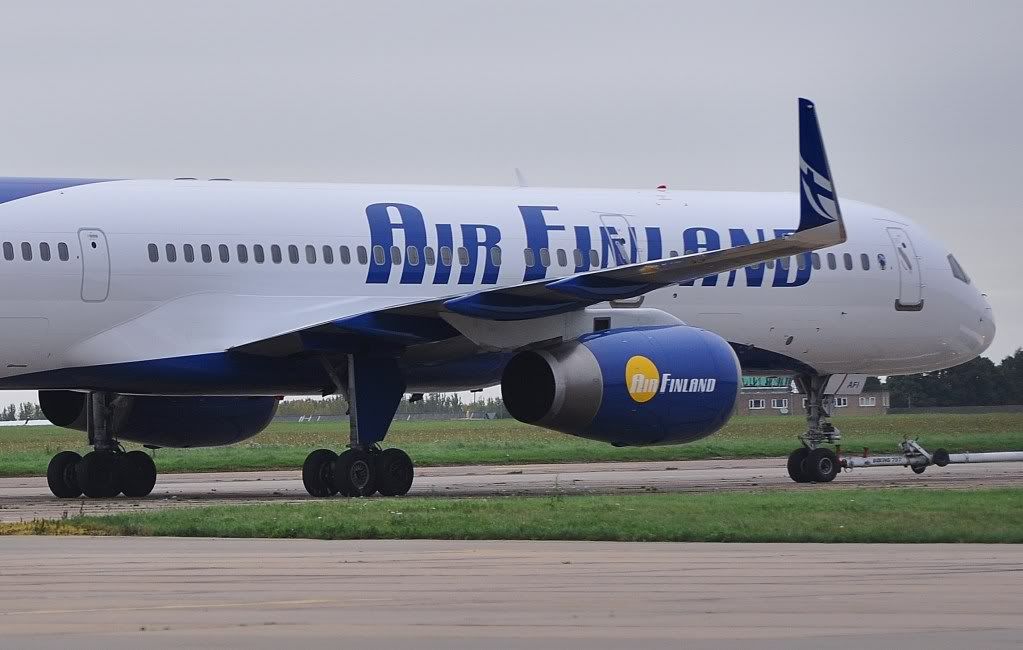
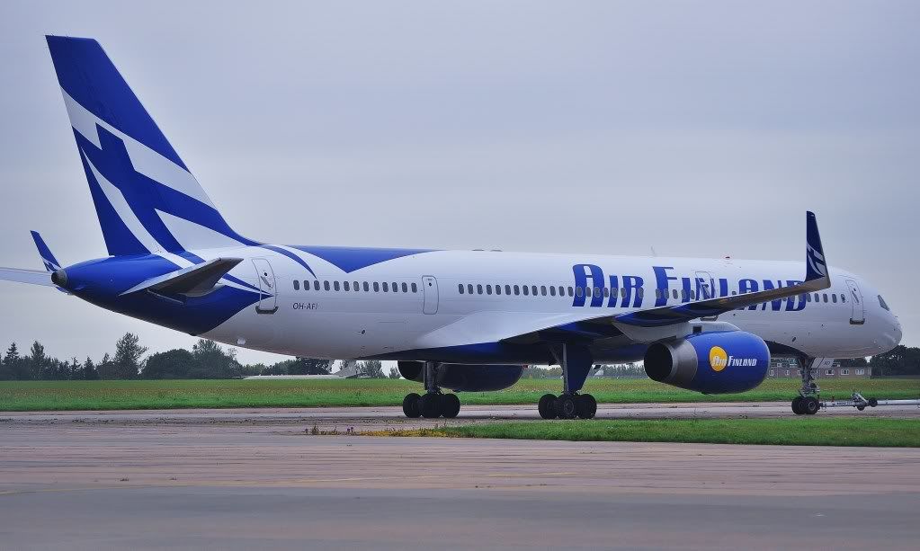
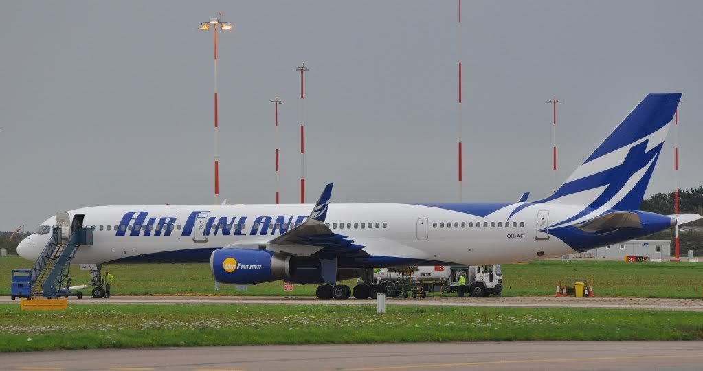
I wish they would drop that 70s style ‘sun spot’ To me it just shouts cheap charter outfit. I really like that new scheme but IMO that spot spoils the otherwise very stylish livery…c’mon you marketing guys in Helsinki, get sorted;)
Agreed. The yellow spot looks garish and out of place. Spoiling what is otherwise a beautiful livery. 🙁
Thanks for sharing Keith!
By: MSR777 - 4th October 2010 at 21:30
I wish they would drop that 70s style ‘sun spot’ To me it just shouts cheap charter outfit. I really like that new scheme but IMO that spot spoils the otherwise very stylish livery…c’mon you marketing guys in Helsinki, get sorted;) Ooops sorry Keith thanks for the pics.
By: Newforest - 3rd October 2010 at 09:41
You put the finger on it, they finally found the finances to finagle some finesse in their colour scheme. Ad infinitum. 😀
By: keithnewsome - 2nd October 2010 at 23:09
Newforest😀 Fink you will find they used their finest craftsmen to put the finishing touches to the finest respray of today.
If i had to put my finger on the final outcome of todays movements I would fink the financial benefit of the finery displayed within this colour scheme would be finite.
That is taking nothing away from the supurb finish on the finnish aircraft !!
Finally finished Keith. 😀
By: Newforest - 2nd October 2010 at 22:44
Guess it’s an improvement using a stylish Finnish emblem on the ‘fin’😀
By: MANAIRPORTMAD - 2nd October 2010 at 22:08
Oooh I like it, prefer it to their previous scheme anyway. Well captured! 🙂
Cheers,
Matt.


 Sign In
 October 2, 2010 at 8:24 pm