By: arnab - 3rd July 2007 at 10:09
Open for any Crits!
Hey Kabir, plz feel free to leave ur comments mate! 🙂
By: KabirT - 2nd July 2007 at 14:30
Kabir have you heard anymore about the starting date for Indian airlines ( Air India ) inaugural flight into Melbourne??
Nothing new i have heard till now Steve. I’ll look more into it.
By: steve rowell - 2nd July 2007 at 10:16
Kabir have you heard anymore about the starting date for Indian airlines ( Air India ) inaugural flight into Melbourne??
By: Himanshu - 1st July 2007 at 08:38
Thanks a lot Arnab..
By: KabirT - 29th June 2007 at 10:32
This was my story line…
:rolleyes:
hmm… very interesting. I wouldnt say much about the story line now since the design is fixed. But congrats. 🙂
By: arnab - 27th June 2007 at 10:40
This was my story line…
:rolleyes:
By: Himanshu - 25th June 2007 at 08:52
Hi Arnab.. do you have some moer details as to what options you had and can also tell us something which led to this design detail..
By: arnab - 25th June 2007 at 06:33
Thanks guys for your feed back
Thanks guys for your feed back!
I was so keen to know that wht people think on it… I’m so proud that most of you liked it. Well keeping few comments in mind, plz accept that fact it was a tough project..and this is was my first assignment for any branding job, there were some hardles and constrains which I had to follow, like the gold instead orange Chakra. Speed line or water line on the belly… you know end of the day the designer only can give options not a choice!
Cheers
By: 21Ankush - 25th May 2007 at 07:45
the problem with that blue livery by Abraham is that the colours are totally new for AI and the peacock feather looks a little similar to the Thai Airlines symbol..not distinctive enough..the saffron Chakra on the Indian A320s were beautiful- and its a very Indian symbol.
By: 21Ankush - 25th May 2007 at 07:41
bring_it_on, the “fat dude” was the Air India’s ‘Maharaja’ mascot. very popular in the 70s and 80s, and I’m quite sure that promotional pics will feature him still..
as for the brand new livery after the merger, I feel it looks great ! I see the current Air India 777-234s at Everett everyday and believe me, its a very pretty livery too..much more modern than the earlier version and a lotttt nicer than some really drab ones around- especially disappointed with the Air Canada’s new livery. its a wierd light blue and the Maple flag in red..
By: steve rowell - 24th May 2007 at 07:47
Does this mean we’ll get to see Air India in Melbourne after all??
By: bring_it_on - 24th May 2007 at 04:53
But why take out the Fat dude ? I always loved his smiley face !!
By: KabirT - 24th May 2007 at 03:02
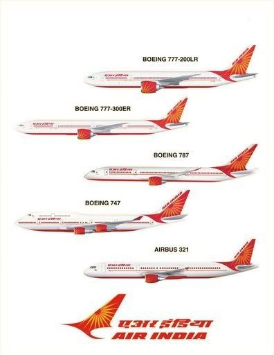
A new scheme for Air India has always been a problem. They introduced a new livery in the 90’s (designed by Landor if my memory serves me correctly), but there was public uproar in India because the Window Palace’s had disappeared, so this new livery goes some way to dealing with the issue. Here is the last attempt at a rebrand..
yes and the uproad was absolutely justified, as if Air India does not have a bad enough reputation than to add a worst livery to that. :rolleyes:
By: Bmused55 - 23rd May 2007 at 14:53
Well, actually I’d have based some designs tthat retained the window temples and encorporated the Chakra wheel. Just like they have done.
In fact… I think I have a few primitive first idea drafts on my hard drive that feature such which I made… oh… going on to 18 months ago now.
By: Himanshu - 23rd May 2007 at 13:52
Bmused55.. what would have been your recommendations..
By: rdc1000 - 23rd May 2007 at 13:35
A new scheme for Air India has always been a problem. They introduced a new livery in the 90’s (designed by Landor if my memory serves me correctly), but there was public uproar in India because the Window Palace’s had disappeared, so this new livery goes some way to dealing with the issue. Here is the last attempt at a rebrand..
By: Bmused55 - 23rd May 2007 at 07:55
I still think this design is far far better
………………………
from R P Abraham (MAP)
As with most of Abrahams work, its pure eye candy and nothing more.
There is nothing about that livery that shouts “India”. Not the colours, not the logo, not the typface, nothing.
Don’t get me wrong, its nice and elegant and would work for a second tier airline. But as a livery for a flag carrier, it lacks substance. Thats most likely why, if even submitted, it was not chosen.
Air India needed a livery that shouts “India” at the same time as encorporating the Indian and Air India identities, and most importantly, kept the famous window temples. Well,… they got one!
I like the new livery.. like Kabir said: “Very Indian”.
Kudos to the design team.
By: bring_it_on - 23rd May 2007 at 05:01
still think this design is far far better
Very Air newzeland like , dont you think?
it is already in use with AI’s loco arm Air India Express
THX
I also like the 772L livery that they have sitting at boeing –
By: KabirT - 23rd May 2007 at 04:23
If you are refering to the livery in the ad.. it is already in use with AI’s loco arm Air India Express.
As for the new livery… i like it, very Indian. I am also glad they kept the window design.
By: bring_it_on - 23rd May 2007 at 03:31
Not bad at all , better then the previous one but could have been better . My observation –
* Why did they not include the chubby fellow that they had in the previous livery?
* the red line running from underneath the windows is not required
* they should have not written air india on the tail
I pulled this out of a boeing ad , was this ever considered?


 Sign In
 May 22, 2007 at 10:07 pm