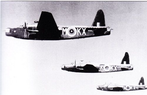
Can anyone help with the likely colours of the roundel on Whitley Z9226? The logical assumption is that the white band has been significantly darkened to tone it down however the central red appears much lighter than I would expect, it seems a similar shade to the white on the tail but this could be an optical illusion.
[ATTACH=CONFIG]226676[/ATTACH]
Taken from WW2 images on Flickr

By: steve_p - 26th March 2014 at 19:26
The codes therefore are the previous grey ones not the red ones, and then the colours at least show consistently, although I don’t know which filter would make the red appear so light. A red filter?
Yes. A red or orange filter lightens red and darkens blue. They were often used to increase contrast in skies.
By: Graham Boak - 26th March 2014 at 19:16
The codes therefore are the previous grey ones not the red ones, and then the colours at least show consistently, although I don’t know which filter would make the red appear so light. A red filter?
By: antoni - 26th March 2014 at 16:49
There is nothing particularly unusual about the Whitley. There were complaints that the large area of white of the ‘A’ type roundels made aircraft too visible especially in searchlight beams. This was compounded by the contrast between the Special Night (very matt) finish and that of the roundels that were Type ‘S’ (smooth). The Air Ministry carried out experiments and trials to measure the reflectance and so forth and eventually came up with Type ‘C’ roundels that had a narrower white band. These were introduced from May 1942. All carefully worked out scientifically.
In the meantime squadrons took to taking matters into their own hands. In some Hurricanes had the white painted over with blue turning them into Type ‘B’ roundels whilst elsewhere the white was painted over with black or grey. 311 Squadron is particularly known for this.
By: inkworm - 26th March 2014 at 15:27
One suggestion I’ve had from another source is that due to being a special scheme the white was replaced with a black, due to the matt finish to the aircraft the slight gloss gives it a very different look.
By: Graham Boak - 26th March 2014 at 15:02
Ortho would tend to make both yellow and red appear dark, which isn’t happening here. Some odd filter perhaps, but as the codes are also presumably red, there doesn’t seem to be an obvious explanation. Not to me, anyway.
By: inkworm - 26th March 2014 at 12:25
I hadn’t actually considered that it could be orthochromatic and the fin flash does seem to back it up, thanks everyone.
By: Zidante - 26th March 2014 at 11:58
Doesn’t the fin flash give away the shift of colours? Looks like yellow outer, blue, white then red inner to me.
By: adrian_gray - 26th March 2014 at 11:54
It’s not on orthochromatic film, is it? That might explain the odd colours…
Adrian
By: Tin Triangle - 26th March 2014 at 11:07
Strange-it doesn’t quite look like the usual field modification of painting the White ring Black (as seen on Wellingtons, Defiants, etc)-but perhaps it’s just an odd effect of the light or a property of the film used?
There’s another pic here:
http://www.ww2aircraft.net/forum/album/black-26-white-photos/p5861-armstrong-whitworth-whitley-mkv.html
which makes it look like the blue has been carried on over the white, leaving a narrow yellow ring, wide blue ring and narrow red ring. I agree that the very pale colour of the red portions (both roundel and fin flash) is a bit odd.


 Sign In
 March 26, 2014 at 10:58 am