Okay, I just can’t decide…
Some sources claim the checks are black and white whilst others (particularly the Squadron/Signal book) insist that they’re red and white. Judging by the insignia tones (especially the centre of the roundel on the wing underside), I’m inclined to think that they’re black. Any thoughts?
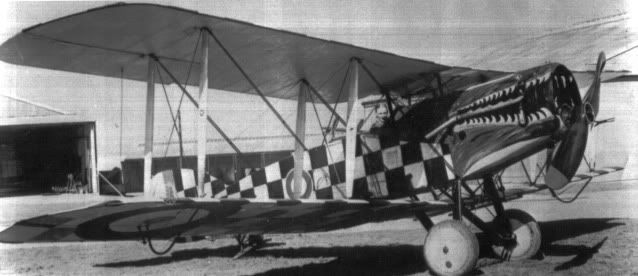
Also begs the question as to whether the mouth is red or black too – logic would say red but again, the tones suggest black?

By: ssculptor - 31st March 2025 at 10:28
A few questions from a newbie about the color and paints.
I am new to this forum and upon reading this thread it just occurred to me that I do have a question or two. :confused:
1) Was the white of the checkerboard achieved by the application of white paint or was it just the color of the canvas with a clear coat of varnish over it?
2) Were the paints used enamels or lacquers. I know that is an odd question to ask but I was just curious. Or were they a dope of some kind.
If they were a dope, then what is dope? I used to use it to paint my flying models back in the late 1940’s but was that the same thing? Or had the formulation changed from 1918 to 1949?
These days I normally paint my models with the usual paints available at the hobby stores, the enamels and acrylics for the static models and the fuel proof products for the flying models.
But now that I am changing over to electric motors for the flying models I no longer need the fuel proof paints.
3) Last question, if you do not mind. Was the Crocodile a plane from a training squadron back in England during the war or was it a post armistice paint job.
Thank you all for indulging me.
Stephen 🙂
By: Chox - 3rd May 2009 at 16:29
Problem is that even regardless of variations in tone (whether caused by film or lighting) there’s not much difference between red and black so it’s a hard one to call. I can’t work-out where the assumption that the checks are red has come from. You’d imagine that there was some “definitive” reason, but I get the feeling that someone has just assumed they were red and the notion has just been carried-on.
By: steve_p - 2nd May 2009 at 13:52
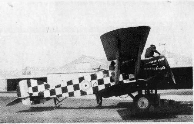
I’m not at all convinced that the two photos have been taken using different film stocks. The reason for the lighter roundel blue in the lower could equally have been due to direct sunlight hitting the airframe in a particular way. The quality of light and the background looks the same in both photos so, could both of the photos have come from the same Photographer/camera?
There are a hundred and one reasons why tones differ from photo to photo, type of film stock used is only one of them.
Best wishes
Steve P
By: Chox - 2nd May 2009 at 05:48
It’s a real headache. The second photo would suggest that the checks were red, as they match the tone of the roundel centre. On the first photo, it’s far fom certain as they still look black, but on the wing underside they match the tone of the roundel centre which suggests that they were red. The conclusive factor would be to see if the tones match the red of the rudder’s insignia but the photograph is perfectly positioned so you can’t see that bit!
The other slight worry is that there appears to have been a Pup around at the same time, marker very similarly. I haven’t looked into this but it appears that the checks on that machine were black/
white and it makes me wonder if there was any connection between the two aircraft in that there may have been some “fashion” at the time for black/white checks?
Guess the only way to solve this problem is if any other pictures of the aircraft exist. I’m told that they do but heaven-knows where.
By: Malcolm McKay - 2nd May 2009 at 01:26
Err, I’m maybe missing something but wouldn’t black squares look like that as well, regardless of what film type was used?
Best wishes
Steve P
Quite possibly and in my first post I did say that nothing was certain. I err on the side of red because of the tonal values in the pan film print, but I could be wrong.
By: steve_p - 1st May 2009 at 22:35
The B/W tone in the second indicates that orthochromatic film was used. This lightened blues and darkened reds so, based on the similarity of the dark toned red with the fuselage squares, leads to the conclusion that they are red.
Err, I’m maybe missing something but wouldn’t black squares look like that as well, regardless of what film type was used?
Best wishes
Steve P
By: Chox - 1st May 2009 at 22:19
That’s an interesting subject – I’ve never been entirely convinced about the roundel colour business and I guess a great deal of assumption must have been based on the examination of photos which vary in tone for the reasons mentioned. Mind you, the roundels are the least of my worries – I’d be happy to get a definitive answer on the check colours!
By: Malcolm McKay - 1st May 2009 at 13:30
There was a trend some years back to show WW1 roundels as a pale to medium blue. I have long thought that this was a mistake based on the wide use of orthochrome film. If one has a look through books like J. M. Bruce’s British Aeroplanes 1914 – 1918 most of what one night call “official” (for want of a better term) pics of factory fresh aircraft e.g. Sopwith, Airco etc. have roundels with the typical ortho effect.
IIRC ortho was popular because it gave a very clear sharp image.
By: Rlangham - 1st May 2009 at 11:44
Here’s some original WW1 ’roundel blue’
By: contrailjj - 1st May 2009 at 06:13
I may be stating the obvious, but…
Orthochromatic negative film was the norm and Panchromatic was the rarity.
I’m sure many others here on the forum can further substantiate this, but basically ‘Ortho’ has (had) a sensitivity to blue and green colour wavelengths.
Even 20 years ago when I was slaving in a ‘dark-ages’ studio shooting PMTs (photo mechanical transfers) the film was Ortho, which is why all our base artwork was in ‘non-repro’ blue (somewhat close in shade to mid-20s RAF roundel blue) and we retouched all the negs with black or dark red.
Don’t let your perception of today’s RAF roundel blue deceive you (WWI roundel blue was not as far as I can tell nearly as dark as even WWII and modern roundel blue and 1920s roundel blue was by contrast, very light in tone) – to Ortho film, blue is blue (as in almost not there) and it is no-where near as dark as red could ever be – and red to Ortho is barely 5% lighter in shade than black – but black is always black – even the slight ‘tweak’ in levels in P’shop will show a difference. If I remember this correctly – you can replicate Ortho today using commercially available, run-of-the-mill BW neg film by utilizing a Cyan lens filter.
The second photo compounds matters, in that while it was obviously shot with Ortho film, it has been reproduced (lithographed) at least once and now suffers from a moire screen pattern which has degraded the image to a point that no real information/detail may be gleaned from it.
For me its easy to see, 2 volumes worth of turn of the century to 1930 images in the last year – simple, but then confusion reigns on another of my projects – I still haven’t figured out why 1960s day-glo ‘red’ appears white in some prints and mid-grey in others – I’ll save that for another day/thread.
By: Chox - 30th April 2009 at 16:24
Think you might be right – it was only recently that someone mentioned that the red might actually be black, and it seems to have been accepted wisdom that it was red all along. Hope so anyways!
By: Malcolm McKay - 30th April 2009 at 11:19
The B/W tone in the second indicates that orthochromatic film was used. This lightened blues and darkened reds so, based on the similarity of the dark toned red with the fuselage squares, leads to the conclusion that they are red. But because of the darkening effect if we took only that photo then black cannot be ruled out. However the first pic is panchromatic which basically show reds and blues in their right hue relationship, and in that pic the only red is under the wing in the shadows so we get an optical distortion which makes it seem lighter than the fuselage squares. Again, and admittedly we cannot be 100% about this, I would opt for red and white.
By: Chox - 30th April 2009 at 10:10
Hmm, so I guess we should also assume that the roundel blue was darker (ie standard shade) that the second photo suggests, or is the first photo more misleading?! Guess my question here is whether aircraft from that era had standard blue roundels or a paler shade?
I read somewhere that the red (black?!) checks were subsequently extended to the upper wing lower surfaces and that photos exist – any ideas where?
I suppose the conclusive answer to this colours riddle would be if anyone had any idea why the aircraft was decorated in such a fashion – presumably it must have related to something with red or black/white checks within the unit otherwise I don’t see why such a scheme would have been chosen at random?
By: contrailjj - 30th April 2009 at 04:29
What doesn’t help is that two types of film appear to be used. The second one is ortho (very faded blue reproduction) and going on the similarity in hue with the red of the roundel and tail stripe I’d go with red/white checkers. The first appear to be pan and the only red in the pic that can be seen is the underwing and to my eye it appears to be the same intensity as the dark checks on the fuselage, so again I’d go with red/white.
I concur fully (film comments as well) – definitely red and white. As for the mouth – based on the upper image, I’m going with black inside the mouth while the outer cowling areas appear to have ‘streaky’ application of green/brown.
JJ
By: Malcolm McKay - 30th April 2009 at 04:22
What doesn’t help is that two types of film appear to be used. The second one is ortho (very faded blue reproduction) and going on the similarity in hue with the red of the roundel and tail stripe I’d go with red/white checkers. The first appear to be pan and the only red in the pic that can be seen is the underwing and to my eye it appears to be the same intensity as the dark checks on the fuselage, so again I’d go with red/white.
It is a real pity that Parliament didn’t pass a law when photography was invented that demanded under threat of severe punishment that all photographers had to note colours on the back of the print – failure to do so being a particularly painful tongue lashing from the colour police.


 Sign In
 April 30, 2009 at 2:20 am