Hi All,
Here are a few from Heathrow today. I’d like to encourage a bit of a critical look over these; it’s my first attempt shooting raw and I’ve tried a whole different work flow so i’d like to hear what people think!


Like I said, feedback is appreciated 🙂
Thanks,
Andrew

By: Manston Airport - 18th February 2009 at 22:55
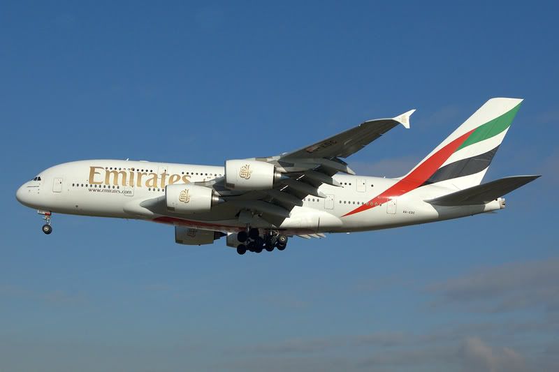
Nice shots andrew like the Austrain A319 & the Emirates A380 😎
James
By: abutcher1985 - 18th February 2009 at 21:27
Thanks all for the great feedback
Although I didn’t realise it when I uploaded these shots, 7 out of the 9 are pretty new liveries introduced in the last 5 years!
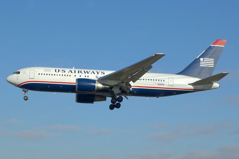
My favourite has to be the US Airways colours… a huge improvement on on the previous!
Andrew
By: miikey - 18th February 2009 at 10:04
Gota love that Air Canada livery.
Great Shots!
By: EGTC - 14th February 2009 at 20:34
Nice shots.
By: Bristol_Rob - 14th February 2009 at 19:26
Nice Shot’s Andrew
Glad the weather was great for you
Loving the Emirates A380
Nice one
Rob
🙂
By: PMN - 14th February 2009 at 19:21
Hi Andrew,
Very nice work indeed! They’re well composed, well exposed and sharp but my only criticism if I were going to be picky is that a couple of them look a little ‘flat’ and lifeless. This is very easy to sort simply by slightly increasing the contrast and saturation. Here you see the original:
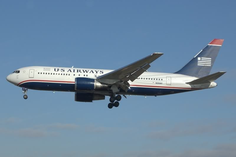
It’s a nice shot, but with the darks made a little more pronounced, mid tones lightened just a touch and a moderate increase in saturation it really jumps out of the screen at you more. It’s bolder and more life-like.
The same is true of the A380. Here’s the original:
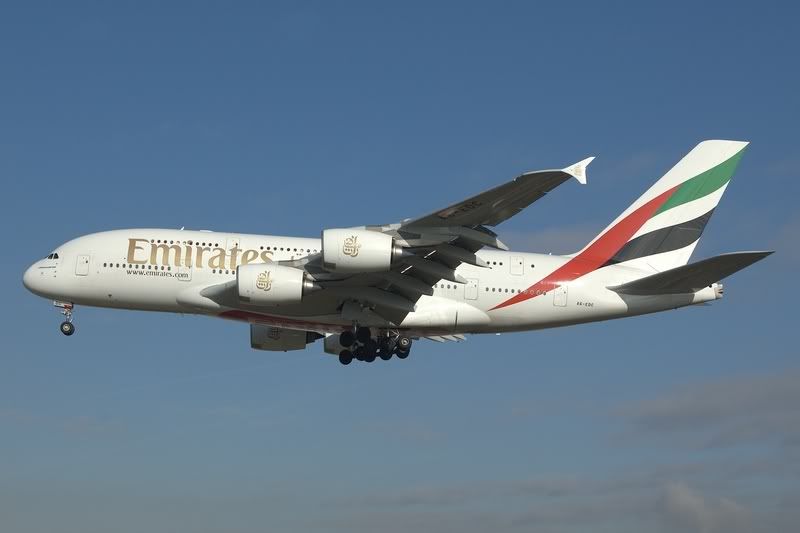
And after the darks have been increased, mid tones lightened slightly and saturation added:
When you see aircaft like these in real life when you take the photo, you see bold colours and contrast with your eye, so try and replicate that as closely as possible on the screen. This isn’t always easy as the human eye has a far greater dynamic range than the digital camera (dynamic range refers to the difference between the darkest and lightest parts of a scene and how much of that difference your eye or your camera perceives), but as you see in the above examples, with two simple steps (levels adjustment and saturation) they look much more ‘real’ and vibrant.
Something else to try is playing with composition. Try maybe getting in a little closer and taking photos from different angles. Cropping the front of the aircraft from the nose to just behind the main landing gear is a great perspective, and adding different angles keeps the images you post here or upload to photography sites more varied and interesting.
All in all a very good set, though. You certainly have the essential elements of quality pretty much sorted (exposure and sharpness). Perhaps now just spend a little time improving the more aesthetic side of things, i.e. composition and colour.
Feel free to drop me a PM if I can help further. 🙂
Paul
By: Airline owner - 14th February 2009 at 18:27
Nice load there Andrew. Like the Kuwait 777 and the Emirates 380. 🙂


 Sign In
 February 14, 2009 at 5:39 pm