I am in the process of scanning some old photos of the Proctor 5s that arrived in New Zealand during the late 1940s.
I note that, in their original colours, they had a circular logo painted high up on the fin, thus:
![]()
Unfoturtunatly, given the camera quality available at that time, none of the negatives are of sufficent resolution to clearly examine this logo.
Is it a Percival logo?
If so, was it just applied to post-war built Proctor 5s?
I undestand that the first Percival emblem was a Gull, in flight. When did the change to this one occur?
Does anyone have clear artwork of this design that they can post?

By: l.garey - 19th September 2014 at 06:11
t looks like this one number 5. From the ‘Flying Scale Models’ MAP book. Perival Gull
Dave
The same photos as in post 3, above, appear in the Aero Modeller Annual 1953 (page 61). The text states that the logo with the banking gull is hand-painted in black, yellow and white on Proctor G-AIEP. There is a photo at https://www.flickr.com/photos/dwhitworth/5450165913/in/set-72157626751303608
The same article also illustrates G-AHWU with a similar logo on the fin, but with a blue background.
By: Snoopy7422 - 18th September 2014 at 03:13
A postwar design. Very similar to that used on their stationary at the time, but quite different from the pre-war logo.
Somewhere I’ve got some Proctor V manuals. I’m pretty sure they use the Roman ‘V’.
By: flyernzl - 17th September 2014 at 06:27
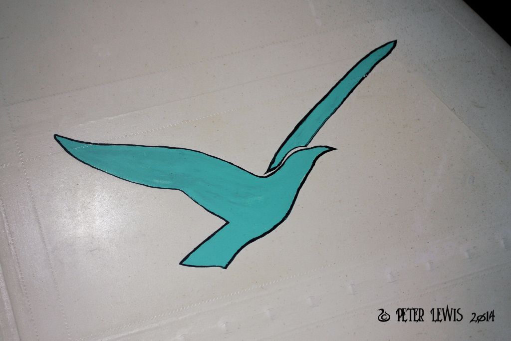
Following up – here is the logo currently on Proctor 5 ZK-AVW, starboard fin.
Photo taken today, 17th September.
The aircraft is currently stored unrestored, so presumably this is original.
Interesting to note that although these postwar aircraft were referred to as the ‘Proctor 5’, the image shows ‘Proctor V’.
By: flyernzl - 10th September 2014 at 07:32
Earlier this week I was able to inspect Percival P.44 Proctor 5 ZK-ARP.
The logo now on the fin is obviously non-standard
By: flyernzl - 5th April 2014 at 17:08
Judging by the lack of any response, apparently not.
OK, so I have checked the identities of the NZ ex-RAF/FAA Proctors through GINFO and also Bruce Robertson’s ‘British Military Aircraft Serials’, and can list as follows:
So we have conflicting information on ZK-AHQ and ZK-ALS.
Any comment/resolution on that appreciated.
Thought – what was the difference between a Proctor 1 and Proctor 2? Just radio fit? How easy was it to convert one to the other?
By: flyernzl - 23rd March 2014 at 10:06
To bend the discussion slightly, is there an on-line available listing of RAF Proctor serials/model numbers?
There seems to be some discrepancies between our NZ listing of the ex-service Proctors and the data available on G-INFO. We have found some errors in the G-INFO data in the past, and would like to double check.
By: Snoopy7422 - 17th March 2014 at 22:09
Snoopy do you have an example of both the pre and post war logos? I am keen to track both down.
The post-war, as per Post No.1 above I do not, as I’m only focussed on 1934-’39.
The pre-war I do, on another PC currently in storage. Latter logos tended to get both the colours and the design wrong on restorations. The white is easy, and the dark blue hard to get wrong, but the ‘sky’ in the logo was actually almost Turquoise***, not just ordinary sky-blue. All the dark areas were the Dk. Blue, but the outer ring was actually gold-coloured. This, of course, doesn’t show in old black & white images – and there exist, to my knowledge, no colour images.
The waterslide-transfers were different for each Percival type, although the London Head Office address was the same for all, as was the rest of the design. They were marked either ‘Gull’, ‘Vega Gull’ et al, as appropriate.
This isn’t my personal opinion, but came from a pre-war member of the drawing-office staff at Percival’s many years ago who produced an annotated drawing.
*** I have a recollection that, unless one specified otherwise, the standard works-colours for Gulls & Vegas was Titanine Silver flying-surfaces, and a ‘blue’ fuz. (This ‘blue’ may well have been the same or very similar to that used in the Percival fin-logos pre-war.). Some of the 1930’s periodicals and sales literature showed coloured, printed imaged of this scheme (Look at the covers of ‘Flight’ and ‘The Aeroplane’ of that period.), and interestingly, it’s usually portrayed as a rather aquamarine-blue, even allowing for the vagaries of 1930’s colour-printing.
By: Tango Charlie - 17th March 2014 at 19:11
The logo in the photo above is neither the pre-war design nor the post war design, although closer to the former.
Snoopy do you have an example of both the pre and post war logos? I am keen to track both down.
By: Snoopy7422 - 17th March 2014 at 11:45
The logo in the photo above is neither the pre-war design nor the post war design, although closer to the former.
By: flyernzl - 15th March 2014 at 23:12
If you would care to pm me with an email address I will forward.
Done that, thanks.
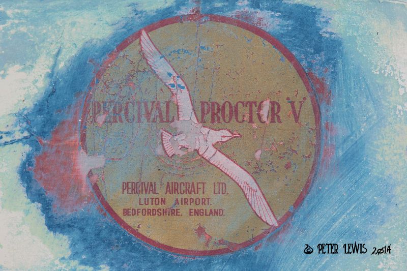
Guy Clapshaw in NZ has the very logo on the fin of his Proctor Mk 1
Here is the Proctor logo that is on the fin of Clapshaw’s ZK-DPP.
It looks different from the 1940s version to me – the bird’s starboard wing is extending outside the circle, for starters.
![]()
Also, if this logo was only applied to postwar Mk5s, why would it appear on a Proctor 1 rebuilt to resemble a Vega?
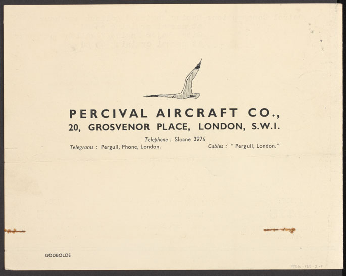
Flyernzl, is that a very early Percival Aircraft letterheading (post #1)?
I have to admit that the Percival letterhead is a link to the image from the National Museum of Australia website. They hold Gull Six G-AERD. As far as I can tell from what they say, the letterhead dates from 1936.
By: avion ancien - 15th March 2014 at 16:28
Flyernzl, is that a very early Percival Aircraft letterheading (post #1)? The presence of abbreviation ‘co.’ in and absence of the word ‘limited’ from the company name suggests that it predates the formation of Percival Aircraft Limited in 1936 (although I’ve seen some indications that E.W.Percival was using company headed paper after he ceased his association with it). Curiously the name ‘Percival Aircraft Limited’ is in use today (q.v. http://percivalaircraft.com) but the company does not appear to have any connection with the original company of that name.
By: Snoopy7422 - 15th March 2014 at 14:46
The logo in post No.1 is, I think, a post-war design. The pre-war version was quite different, and was White, Navy Blue, (Almost) Turquoise and Gold.
By: G-ASEA - 15th March 2014 at 08:58
t looks like this one number 5. From the ‘Flying Scale Models’ MAP book. Perival Gull
Dave
By: Tango Charlie - 15th March 2014 at 08:41
Percival Logo
Flyernzi, I have the exact logo. It was scanned from an original piece of artwork and re created. Essentially its a seagull in flight, with cloud outline behind and sea below. Included is wording Percival Proctor with the Grosvenor Street address underneath. The colours are an aqua marine back ground with dark blue detail and outline. If you would care to pm me with an email address I will forward. I would be interested in seeing your pictures once scanned. Incidentally Guy Clapshaw in NZ has the very logo on the fin of his Proctor Mk 1, we will be applying to our Proctor restoration. David Beale in the UK who has built the magnificent Mew Gull reproduction also has the logo on the fin. Hope this helps.


 Sign In
 March 15, 2014 at 12:32 am