Sorry to post this. I remember seeing some time ago, a thread in relation to the font size and style seen on Spitfire Instrument panels.
I’m putting together a MKII Panel and am trying to confirm the font and style or the modern equivalents. Unfortunately I can’t seem to find the old thread.

By: oldgit158 - 17th June 2017 at 14:16
Not 100% but I am sure I saw a reference to the correct font used is on the instrument panel drawings.
By: TonyT - 16th June 2017 at 16:09
Psst
http://web.archive.org/web/20020210183915/members.aol.com/p5219/fonts.htm
By: TonyT - 16th June 2017 at 16:03
What i need is a beer :p
By: Rocketeer - 15th June 2017 at 06:19
The guy you need now is Steve Rickards.
By: Bellarine - 15th June 2017 at 04:47
Spartan doesnt look quite right. In the placard pics above there are serifs on the letters, which would make it more Copperplate Gothic Bold. Thats the one I used for RAAF WW2 panels but I edited the font and took the serifs out. Lengthy process but worth it
By: windhover - 14th June 2017 at 15:53
The proper font is Spartan… Mergenthaler Linotype’s unlicensed version of Futura, copied weight by weight from Bauer. It was produced in 1939.
There is no free download. The nearest to the RAF 851ATH style of lettering is Helvetica Medium Condensed.
By: Moggy C - 14th June 2017 at 15:37
Serious font spotters inevitably start with the ‘G’ (Upper and/or lower case where available)
Moggy
By: QldSpitty - 14th June 2017 at 13:15
I tried Consolas for my designs.
[ATTACH=CONFIG]254086[/ATTACH]
By: HR339 - 14th June 2017 at 11:18
Was it one of these two?
http://forum.keypublishing.com/showthread.php?59532-Spitfire-placard
http://forum.keypublishing.com/showthread.php?130319-Cockpit-label-fonts
I found them quite useful/interesting when preparing Mosquito placards. I ended up using News Gothic MT, which is of the period but American. Sufficiently close that only a serious font-spotter will pick up the differences: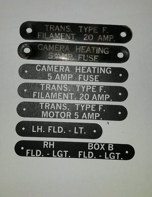


 Sign In
 June 14, 2017 at 8:23 am