Hi all,
Below are some images from AMS I took last year, they have been rejected from various aviation phot forums for many reasons. Could I ask the forum for their brutal and honest critique of these images so that I can improve my skills. I also want to see if the reasons for rejections pop up in this critique. I usually add some comments to the image, they are included.
Cheers
Si
Martinair 369 cross runway 24, call vacated.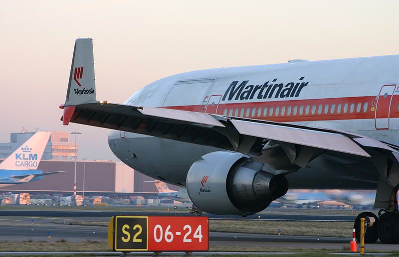
Departing Amsterdam on a very cold January morning. The sun is just rising over the airport.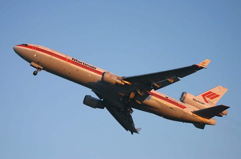
Departing as the sun is beginning to rise, this KLM 737 is off to Munich.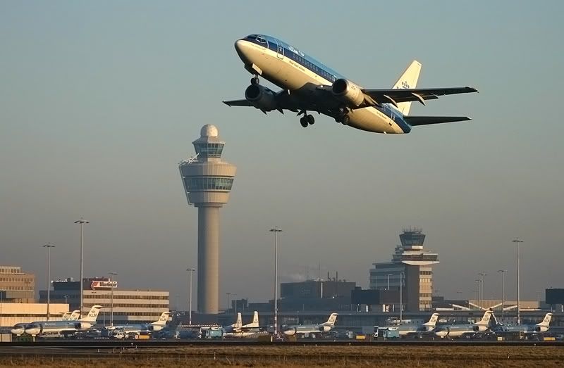
A different perspective of flying…these Jumbos look like caged birds awaiting there passengers so they can burst free and get back to there natural enviroment!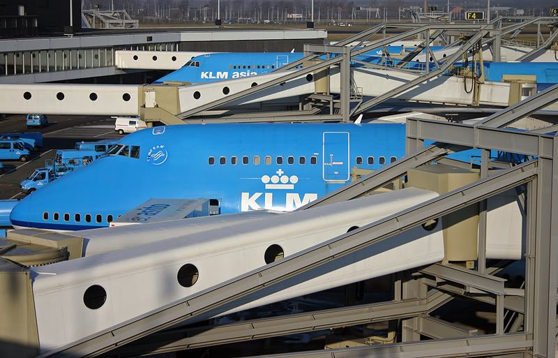

By: Manc - 23rd May 2007 at 10:27
No South American Planes I’m afraid, no time to spend at the airport. Lots of Macchu Picchu and Inca ruins at www.iesphotography.co.uk 😉
Highlights Star Peru 737-200, Aero Condor 737-200, AN24’s, IB A340, TACA 320,321, GOL 737WG, Copa Airlines, LAN A319 A320 767
By: Si Jones - 22nd May 2007 at 16:33
Guys,
Fantastic critique on these shots, your thoughts and opinions are greatly appreciated. Sometimes I think I am slightly arty when it comes to avaition photography, but that is just my style. As long as people like you guys enjoy the images and give excellent feedback as stated above I will continue to try and improve my photography. Once again thanks guys.
All the best
Si
Paul: Enjoy AMS…totally awesome airport.
Manc: Good to see you back on the forum, looking forward to some South American planes on the forum soon!!!
By: maffie - 22nd May 2007 at 12:46
1st picture. Think the back end of the KLM on the left and the posts on the right are in the way. They might let you get away with runway designator. Even though you can’t see much of the plane, its a picture of an aeroplane at work
2nd. Too dark.Can’t see main landing gear
3rd. Too much space between aircraft and buildings. It should be either a clean picture of aeroplane climbing, or a ‘just on rotation’ picture
4th. You know what you wanted to show, but as mentioned earlier, it’s too cluttered. Doesn’t show the plane. However, it is a good ‘airport’ shot
Talk about scrapping the bottom of the barrel for ideas to REJECT these. I’m glad I don’t do the screening on these for a living, ‘cos I’d be letting most stuff through.
Rgds
Matt
By: Ren Frew - 22nd May 2007 at 12:08
To add to what others have said I might suggest that some of the shots are too good for A.net and may I say too ‘arty’ ?
A.net and others tend not to appreciate that kind of thing in my expereince (bloody philistines). You’re work is good however and may perhaps be better appreciated in the general photographic world rarther than the aviation specific world.
By: Manc - 22nd May 2007 at 09:37
Simon
I’m just posting this without reading the other comments first…. I’m no expert!
So here goes.
1. Not Level, need CCW rotation
2. Looks too soft
3. The contrast, colours look wrong on this one. may get motiv aswell.
4. motiv rejection? I quite like this shot be good to sell in magazines this one.
Should be fun when I press the post button to see the other comments 😉
By: wannabe pilot - 21st May 2007 at 18:16
Just to add on that third one…I think maybe a little extra blue in there to take away a little of that yellow hint, and will also add nicely to the KLM blue.
By: adamdowley - 21st May 2007 at 17:49
They are cool photos Si!
For the first, I would say that the obstructing runway signs were a problem, its slightly unlevel, and there is ‘too much’ space in front of the aircraft – crop closer into the nose. ‘part of aircraft cut off’ may have been a reason for rejection – both with the landing gear, but also (and this is being very, very picky), the ‘Martinair’ logo by the over wing exit and the tiny bit of window on the very edge of the photo could also have been picked up by the screener – you need to show the whole window, becuase to ‘them’, half cut off windows make photos not ‘asthetically pleasing’ – its just like cutting a letter from the words along the side of the aircraft in half.
In the second photo, the aircraft is too low in the frame. The photo may also be a touch too ‘red’. The parts of the aircraft that are painted white, should perhaps look a little more ‘white’.
Perhaps you could try a different crop – a vertical crop as shown in the attachment. Also, the photo may have been rejected for bad composition or aircraft not centred. if you explain in the comments to screeners what it is exactly that you are trying to show or explain why you chose the crop, the photo may stand a better chance. Increasing the brightness may also be helpful.
I love the last photo – its really sharp and the colours are great. But for a photo site, I dont think it works. Motive may be questioned by a screener – what are you trying to show – and if you’re trying to show aircraft, there isnt enough of the subject in the photo.
They are just my opinions – they are all great photos, but certain photo sites may not accept them as they are.
🙂
By: rab5869 - 21st May 2007 at 16:27
from what i see of the first one, it might just be my eyes but the buildings looks to be slanting to the right a bit and the aircraft seems to be going uphill i might be wrong.
The Second pic i think might be a bit dark under the wings.
and the third and fourth look ok to me but they are just my opinion but they are still cracking photo’s .
RAB..
By: PMN - 21st May 2007 at 16:06
Hi, Si.
All I can do is offer my opinion, so here goes!
Was the first image a foreground clutter rejection? If so I have to agree in this case. The sign and the post to the right do detract somewhat from the aircraft itself. Without those obstructions it would be a superb angle.
The second image I think could just do with a touch more contrast, as the darks on the underside of the aircraft don’t actually appear to be all that dark on my screen, if that makes sense! Being really picky it’s also sitting just a tad too low in the frome for me personally.
No. 3 could possibly benefit from a slight saturation boost just to make it a little more vibrant and possibly an ever so slight brightness boost if the histogram will allow.
Image 4 I think is superb and I love the idea behind it, but I suspect it just isn’t quite what photo sites tend to look for. They generally prefer the aircraft to be displayed very clearly and be the main focus of the image, as opposed to being a component in an overall scene as is the case here. As a photo though I love it and may well (if it’s OK) steal your idea and go for something similar at AMS tomorrow! We seem to spend so much time trying to shoot aircraft in the open without obstruction, but if we can get nice images by showing them in their environments on the ground as well, who cares if they’re accepted or not. They can all have a home on Flickr if nowhere else! 🙂
As I say, that’s purely my opinion so please take my words as you see fit. They’re all good photos, I’ve just tried to highlight the possible faults people may have seen. This post has made me look forward to my little trip tomorrow even more!
Hope that helps, Si.
Paul
By: snogger_@_EGGD - 21st May 2007 at 16:03
Great pictures, love the first one with the runway sign.
The last one seems a really busy picture with the air bridges etc but still surperb quality images, much better than i could ever do.
What camera and lens did you use for these?
By: kicks - 21st May 2007 at 15:58
Well the first one I think the wing blocks out too much of the rest of the plane. And the last one has potential and I see what you were trying to do but again their is too little of the planes and too many girders in the way.
The middle two I think are good so I have no idea what they were rejected for.
I have never taken a picture of a plane so I’m just basing this on what I see not what I know about cameras, pictures etc.


 Sign In
 May 21, 2007 at 3:36 pm